Діана
Діана 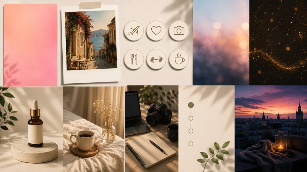
Instagram Stories hold attention for a few seconds at most, so a frame has to grab someone right away, with no second chance. Prompts for Instagram Stories solve exactly that problem: they give an image generator a clear instruction of what’s needed and cut out an hour of trial and error in an editor. The list below has ten ready-to-use prompts for generating images, from poll backgrounds to polaroid-style frames. Each example can be used as is, or you can swap in your own topic, color, or object. Below, we break down each prompt one by one and explain which type of content it fits best.
The Stories format differs from a regular feed post in that a viewer sees the frame for a few seconds and rarely stops to study the details. Because of this, background requirements here are different from the main feed: fewer small elements, more room for text and stickers, and a simpler composition overall. The prompts below already account for this and are adapted to a vertical format and quick viewing, so they can be used without extra tweaks for the Stories format itself.
Minimalist background for a poll
For Stories with a question to the audience, a calm background without extra detail works best, otherwise the text gets lost. Example prompt: “pink gradient background, soft lighting, no objects or people, empty space for text at the top, minimalist style.” A frame like this leaves room for the poll sticker and keeps attention on the question. The gradient color is worth matching to the account’s palette so Stories feel like part of one consistent style rather than a random inserted frame. Checking the result is simple: if a poll sticker and text can sit on the background without overlapping anything, the prompt worked.
If an account runs several polls in a row during the day, it’s worth preparing three or four versions of this same prompt with different gradient colors ahead of time. That way there’s no need to stop and wait for a generation in the middle of putting a Story together. For a cooler palette, just swap “pink” for “blue” or “mint,” the rest of the wording stays the same.
Polaroid-style frame
Polaroid aesthetics work well for personal blogs and travel or lifestyle Stories. Wording: “polaroid-style photo, thicker white border at the bottom, light film grain, warm tones, soft natural light.” The grain effect and warm tint make even an ordinary, unremarkable original photo feel alive. This kind of frame pairs well with handwritten text over the white border.
For a travel series, it helps to keep the same wording and only change the subject: a city, a dish, a view from a hotel window. Matching border thickness and grain level across all frames creates the impression of a cohesive photo album rather than a random collection. For an even warmer tint, add a phrase about an ochre-colored filter to the prompt.
Highlight cover
For highlight covers, consistency across the whole set matters, otherwise the profile looks disjointed. Prompt: “simple line-style icon, single color on a transparent background, no shadows or gradients, uniform line thickness.” Setting one line style for every cover in the set makes the highlights read as a single collection instead of random pictures from different sources.
It’s worth limiting each icon to one object, otherwise details blur together once shrunk down to thumbnail size. For a travel topic, a plane or suitcase silhouette works; for a recipe topic, a fork or a cup. The line color is best pulled from the profile’s main palette so the set of covers reads as an extension of the brand rather than a separate element.
Quote text on a blurred background
Stories with a quote or a thought of the day need a background that doesn’t compete with the text for attention. Example: “blurred background in pastel tones, bokeh effect, no sharp objects, a darker tone in the bottom third for contrast with the text.” A darker lower section of the frame lets you place white or light-colored text so it’s readable even on a small phone screen.
Pastel tones are worth varying depending on the quote’s mood: calmer blue-gray tones for reflections about rest, warm peach tones for motivational text. If the text is long, add a note to the prompt about a darker area not just at the bottom but also in the center of the frame, to leave room for two or three lines without losing readability.
Countdown to an event or sale
For announcing a discount or a product launch, a dynamic but not overcrowded background works well. Wording: “background with subtle motion, light particles, dark tone, empty space in the center for the timer numbers.” The key here is keeping the center of the frame clean, since Instagram’s countdown sticker sits right there and the background shouldn’t compete with it.
For a time-limited sale, a dark palette with one bright accent color that matches the button or discount color on the product itself works well. It’s better to describe the light particles as “blurred” rather than “sharp,” otherwise they start pulling attention away from the timer numbers more than the countdown itself does.
Product photo on a neutral background
For shops and small businesses, a frame without extra elements around the product works best. Prompt: “object on a light gray background, soft shadow underneath, studio lighting, focus only on the object.” A neutral background makes it easy to later add a price or a discount arrow over the image without redoing the photo.
For products with a shiny surface, like cosmetics or glass, it’s worth adding a note about diffused light with no glare, otherwise the generator often adds harsh white spots that weren’t in the original photo. Using the same lighting angle for every product in a catalog also helps keep the account’s feed looking tidy.
Morning coffee aesthetic
Everyday, calm Stories work well for lifestyle accounts and personal blogs. Example: “cup of coffee on a wooden table, top-down view, soft morning light from a window, warm color palette, light shadows.” This kind of frame works both as a standalone Story with a caption about the day’s mood and as a background for a poll about habits.
This frame is easy to adjust by season: in summer, add a phrase about sunbeams and fresh fruit next to the cup; in winter, a blanket and steam over the drink. The top-down view keeps the composition free of clutter, so text placed over the photo reads well without needing an extra background panel.
Gradient background for “yes or no”
A poll with two answer options looks cleaner on a simple color transition. Wording: “smooth gradient from purple to pink, no textures, soft glow in the center.” This kind of background is universal and fits any poll topic, so it’s convenient to keep as a template and reuse regularly.
The center glow should be described as soft rather than bright, since Instagram’s answer-option sticker already adds its own shadow and frame, and extra contrast on the background only makes it harder to read. For a recurring segment, it’s convenient to lock in one gradient as a signature look and repeat it every time without changes.
Collage of several frames in one style
When showing several moments from a day in one Story, it matters that all the parts look like a single whole. Prompt: “three frames in a grid, matching color grading, warm film tone, small white gaps between frames.” Consistent color grading across all parts of the collage is what separates a polished result from a set of random photos.
If the collage has more than three frames, it’s better to specify the exact grid in the prompt, like a two-by-two layout or one large frame with two smaller ones, otherwise the generator may distribute the space unevenly. The white gaps between frames should be an even width, the same principle used in printed photo albums, and it immediately reads as a tidy design.
90s retro style
Nostalgic aesthetics hold attention well right now and often outperform polished modern frames. Example: “photo in the style of home video from the 90s, date stamp in the bottom corner, light noise and grain, muted colors, camera flash.” The date stamp in the corner and light film noise are the details that make the style recognizable even without extra captions or filters on top.
Muted colors pair well with simple text in the corner of the frame set in a monospace font, like on old camera displays. For topics about music or film from that era, this style often works better than a bright, modern picture because it reads as personal rather than promotional right away.
Common mistakes when writing prompts for Stories
The most common mistake is an overly generic phrase like “nice background for a story.” In that case the generator decides on its own what counts as nice, and the result rarely matches expectations. Instead, it’s better to specify a concrete color, type of lighting, and whether the frame includes objects or a person. The more precise the description, the less you have to regenerate the image.
The second common mistake is an overly long prompt with a dozen characteristics at once, some of which contradict each other. For example, requiring “bright colors” and “muted palette” at the same time forces the generator to pick something in between that doesn’t fully match either requirement. An optimal prompt has four or five clear characteristics: scene type, color palette, lighting, and, if needed, style or texture.
The third mistake is ignoring the frame’s aspect ratio. Stories are vertical, and if the prompt doesn’t specify this separately, the generator sometimes returns a horizontal or square image that then has to be cropped, losing part of the composition. Adding a phrase about vertical orientation or a nine-to-sixteen aspect ratio solves this right away and saves time on post-processing. It’s also worth stating separately whether empty space is needed for stickers and text, because without that note the generator often fills the entire frame with detail, leaving nowhere to add a poll or caption on top.
Adapting these prompts to your own account
A ready-made prompt rarely fits perfectly without adjustment, and that’s normal. The first thing worth changing is the color palette: if the account’s main palette is cool, swap “warm” and “pink” for “cool” and “gray,” while the rest of the prompt’s structure stays the same. The second is the level of background detail. For accounts with a lot of text over the image, it’s better to strip extra objects out of the prompt and keep only color and lighting, so the caption doesn’t compete with the background for attention.
The third point is consistency across generations. Running the same prompt several times in a row will produce results that differ slightly in color or composition even without changing the wording. That’s not a bug, it’s just how image generation works, which is why it’s worth generating three or four versions right away and picking the best one instead of expecting a perfect result on the first try. The few minutes spent on this usually pay off, since the finished frame doesn’t need to be reworked or fixed by hand in an editor afterward.
The fourth point is about keeping style consistent over time. If an account posts Stories daily, it’s worth keeping a separate text file with working prompts and notes on which prompt goes with which recurring segment. This saves time and avoids the situation a month later where you can’t remember the exact wording that gave the best result last time. This turns a prompt collection from a one-off experiment into an ongoing tool used without a second thought every time content is prepared.
One last thing worth keeping in mind: no prompt replaces your own taste and understanding of your audience. Ready-made wording speeds things up and removes the technical barrier, but choosing between several generated versions of an image is still a decision a person makes. It’s the combination of a precise prompt and a real editorial judgment call that produces a result the viewer experiences as part of a recognizable account style, not just a random picture from a generator.